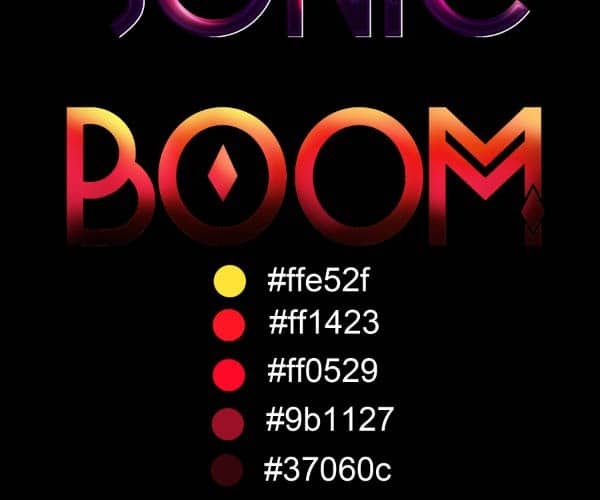
step_1j
You should now have something similar to this:
step_1k

Step 2

Now we are going to add some layer style effects to the type to give it a shiny glossy finish. Double click on the layer thumb to bring up the Layer Styles menu and Check the “Bevel and Emboss” option. On the Depth option keep it at 100% with a size of 5px. On the Shading use an Angle of -29 and an altitude of 37°, change the Gloss Contour to the option showed below:
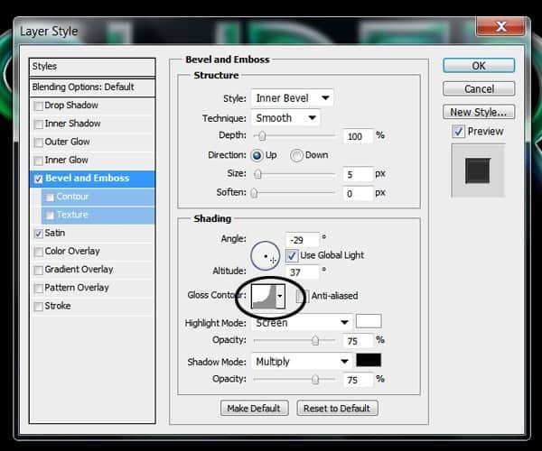
step_2a
Now Check the “Satin” option use the Blending mode to multiply with color black to 39% opacity. Change the angle to -71 , Distance to 11 and size 14. Change the contour to the shape on the example:
step_2b
After applying the layer effects you should have something like this:
step_2c
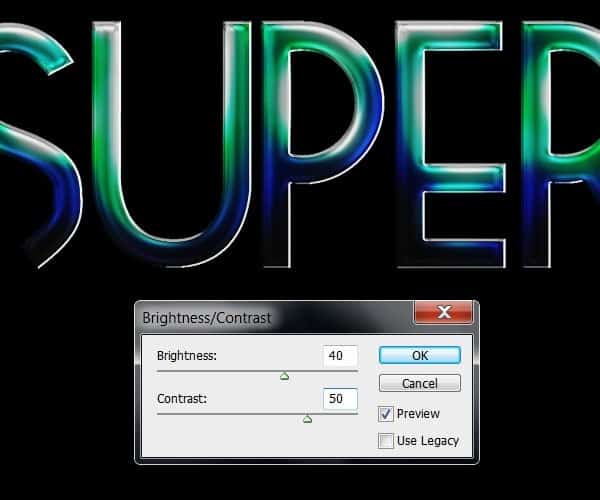
Now create a new layer and merge it into the type layer (Ctrl+E) to apply the effects in the same layer. At this point you can change the Brightness and Contrast of the type again if you feel the colors got too washed out:
step_2d
Now we are going to enhance some of the highlights using the dodge tool (O). Take a very small ,soft brush and set exposure to 10% and the range to “Highlights”. Brush gently over the brightest highlights of the type following the contour of the letter:
step_2e

Step 3

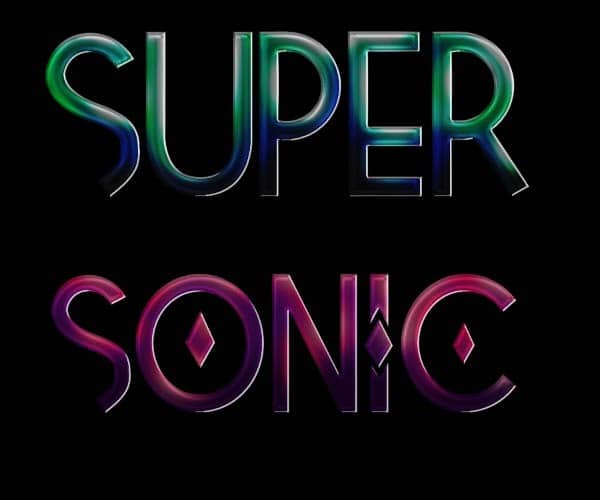
We are basically going to do the same process for the other 2 words. For the second one, I played around with the Tetra font and how the upper case and lower case of the font has different decorations for each letter.
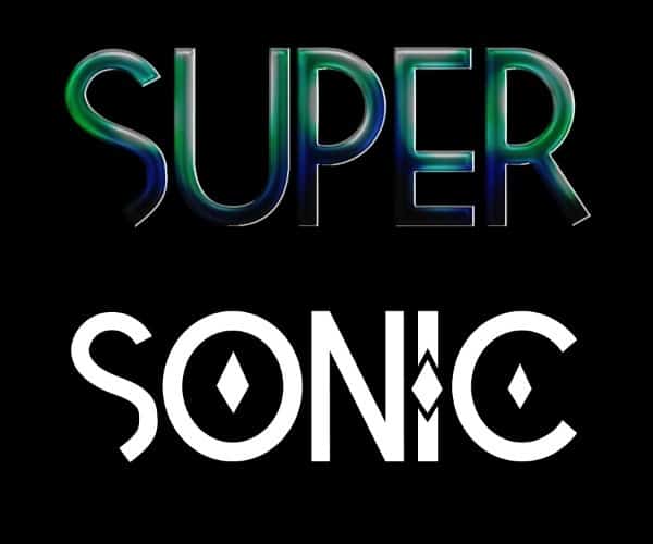
step_3a
For this word, I chose a color palette ranging from a dark purple to very light pink.
step_3b
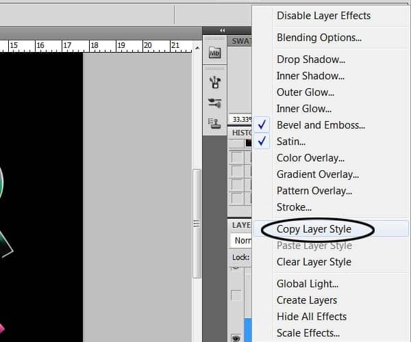
Feel free to experiment with your color choices and combinations. To apply the layer style effect you can copy the layer style from the previous word and paste it on the next word layer:
step_3c
step_3d
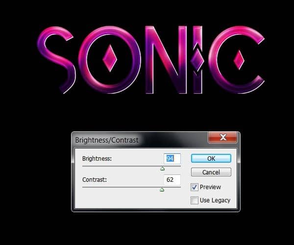
Don´t forget to fix the Brightness and contrast of the image as well as dodging the highlights of the type:
step_3e
step_3f
For the final word I´m going to use a combination of colors going from a very dark brown to red and light yellows.
step_3g
Copy and paste the layer style of the other words:
step_3h
Remember to dodge the highlights and adjust the Brightness and contrast.
step_3i
After you are done coloring type you should have something like the result below:

Pages: 1 2 3 4 5

1 response to “How to Create an Abstract Eagle Photo Manipulation with Adobe Photoshop”

  1. Asim Nazir Avatar
    Asim Nazir

    Brilliant .i need more written lessons of abode photoshop like this and also video

Leave a Reply

This site uses Akismet to reduce spam. Learn how your comment data is processed.

Discover more from Photoshop Tutorials

Get the latest Photoshop tutorials, download and updates delivered to your inbox.

Continue reading