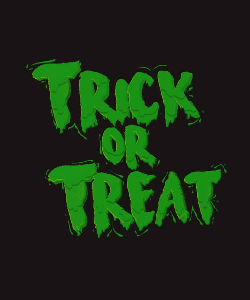

I decided to divided the phrase like so to make it easier to work with:

*LS stands for letter spacing
rick: r = 25px | i = 75 px | c = 75 px | k = 25 px
or : or = 120 px
reat : reat = 10px
TEXT COLOR: #1a9216
I wanted to make certain letters of the phrase bigger than the rest so I played with it’s font size as well (size is indicated on the photo)
Step 6
Now as you can see, the text is a bit transparent we need to make it look more bolder; but before proceeding to do that, I advise you to create a new group for each text layer; rename each group as the text so it won’t be too confusing to look at.

After that, convert all the text layers into Smart Objects (Select the Text Layer> Right Click > Convert to Smart Object..).
Step 7
Now that we did all of that, we can finally proceed. Double-click the text-layer-that’s-been-converted-into-a-Smart-Object’s icon. Doing so would open us to a new canvas filled only with that layer. Now, duplicate the text layer two-three times, depending on how thick you want it to be. I duplicated mine three times.’

I know that there’s a Faux Bold option and we could have used that insead but when I tried using the said option it ended up lagging my laptop (that’s because the font is too heavy to load) which frustrated me a lot. So beware, if you want to use the Faux Bold option instead, go for it. But it does lag your computer for a long while.
Step 8
Once you’re done duplicating save the .psb file, close it and repeat with the other text layers.
Step 9
Then click fx > Gradient Overlay…

(Change it’s opacity to around 12-22%, depending on the text). Repeat with the other text layers.
Step 10
Now we can add the details and we’ll start with the drippings.
Create a New Layer, place it below your Text Layer and rename it ‘Drips’. Change your Foreground color to #1a9216 and start grabbing the Brush Tool (Press B | brush size at around 7-10px, hardness at 100% and spacing at 1% ).

To make the dripping effect, start by brushing randomly around the place where you want the said effect to be. I did a mix of circles and oval shapes:
2 responses to “Learn How to Create This Very Cool Halloween-Inspired Typography in Photoshop”
-

good job
-
Unable to download last resource.
Leave a Reply