

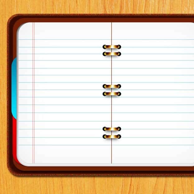
Step 24
And this is what we got

Step 25
Create a new layer and name it as “Horizon lines” , put it under ” Middle line” layer. We set the foreground color #017d93 and set hard brush with size 2px. We draw some horizon lines with same ways as we draw middle line(Step 23). Then we set the ” Horrizon lines” layer as Multiply and lower the opacity 50%. And we got the result like this

Step 26
Next, we create a new layer and name it ” Vertical lines”, set the foreground color # ff0000 and hard brush with size 2px.We draw 2 vertical line (use same ways in step 23), then we set the “Vertical lines” layer as Linear Burn and lower opacity 50%

Step 27
Next, we pick the Ellipse tool to draw some circles with color # 000000 and put it like this

Step 28
Now, we pick the Rounded rectangle with Radius = 40px to create a rounded rectangle like this

Step 29
Now, we add these layer style for it

Step 30

Step 31
Step 32
Here is the result
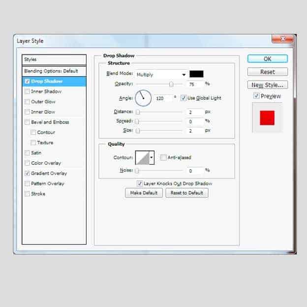
Step 33
Now we duplicate it,right click to clear the layer style,change the color #000000, put it under the metal circle, then go to FIlter > Blur Gaussian Blur

Step 34
And we got the result like this
Step 35
Now we duplicate the metal circle and the shadow and put in like this

Step 36
Next, we create a small rectangle with Radius =40,we name it as ” Red bookmark”, put it over “cover 4” layer and add these layer style for it
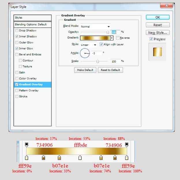
Step 37

Step 38
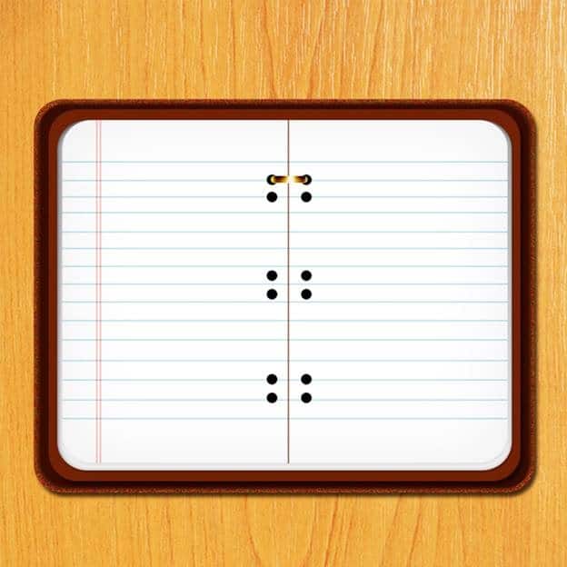
And we got an image like this

Step 39
We duplicate the “Red Bookmark” layer and rename it as ” Blue Bookmark”, in the layer style,we keep the Drop Shadow as it is and and change the Gradient like this

Step 40
Here is the result
Step 41
And we duplicate “Red Bookmark” again, rename it as ” Green Bookmark”,like the step 39, we just change the Gradient for it

Step 42
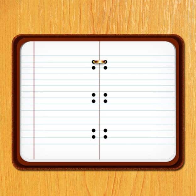
Here what we got

Step 43
We’ve almost done. Now, we create a Group name “notebook icon” , put all the layers we made into this group (except the Wooden background)

Step 44
Now, we press Ctrl+ T and rotate a little bit to left side. And the final result will look like this
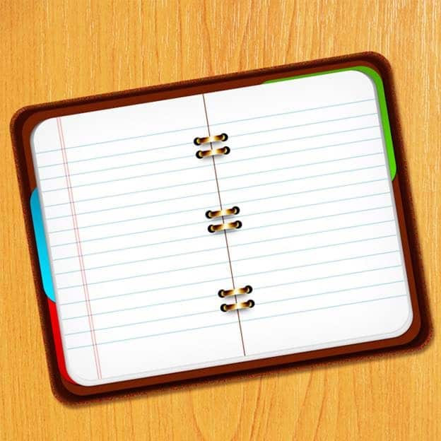
Final Results

Tutorial by Kim Chen
 Thank you for following this tutorial. Hope you enjoyed it!
– Kim Chen
28 responses to “Create a Pixel-Perfect Notebook Icon in Photoshop”
-

Alla feltagningar ifrГҐn Allsvenska Parodin 2020
-
Shouldnt this be done in Illustrator instead??
-
The grammar could be improved but I was able to follow this.
-
Thanks
-
I Agree anyone else?
-
Even though this is a very long tutorial, it is neat and easy to follow. thank you!
-
i did step 23. but when i completed it. i didnt get the result like the picture. what did i do rong?
-
Thanks a lot for your EXERTION !
-
Great article. I especially liked.
-
A very smart approach to explain the things,like your step by step tutorial.
-
Thanks, friend!
-
Yes it is a good tutorial. It would be more good if video tutorial is added.
-
Really great!! Thanks for this tutorial.
-
Hello,
your tutorial is very useful.
However I couldn’t do as Step 23 T_T
When I do Stoke Path… and chose Brush, it doesn’t give me as in Step 24. I tried to draw it manually but I couldn’t do it. I’m just a beginner.Thank you.
-
If you have problems with step 23 after you pressed P in the upper corner are 3 different icons next to the pen: a square with little squares on every corner a square with the pen in the middle and a plane square.
It automatically was on the first one, but for this step you need the second, the square with the pen in the middle.
hope i could help out.
-
I have photoshop CS6, I think it’s not the same thing
-
-
I’m all excited to learn!
-
nice tuts.
thanks… -
great tutorial ….
thank you for sharing… -
I can’t get past step 23. For some reason, the option of “stroke path” is not available to me (it’s grayed out). Is there something I’m doing wrong?
-
very useful tutorial thank u and share continue
-
Thank you. Very simple and clear.
-
This was an easy tutorial to follow. Thank you so much! I would like permission to share my final graphic inside a bonus package of graphic elements.
Please get in touch with me so we can discuss… thank you!
-
bueno esto es mui util
-
nice
-
frnds
ahmad nabeel
ch hamid nawaz -
Really very useful tutorial thank to share with us
-
this comment was written over 10 Years ago (:
-
Leave a Reply