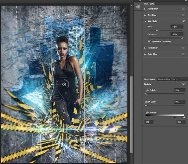
Step 44
To increase the sharpness of the image. Create a merged copy of image (Cmd/Ctrl + Opt/Alt + Shift + E), Convert it to Smart Object (right click on layer > Convert to Smart Object). Go to Filter > Other > High Pass. Set Radius to 2.0 pixels and click OK. Change Blending Mode to “Linear Light” and reduce Fill to 50% (do not use Opacity).

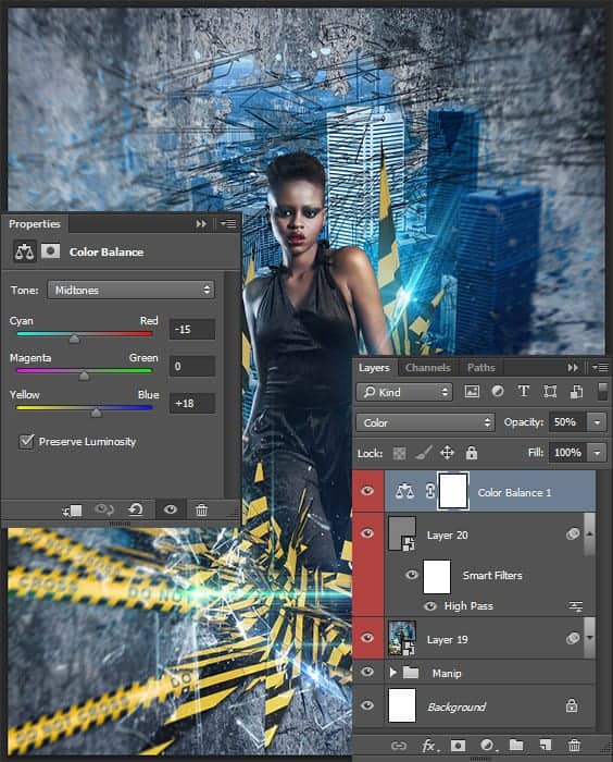
Step 45
There was only final image color correction. I wanted to make blue color a more bright and defiant. So I use “Color Balance” adjustment layer (Layer > New Adjustment Layer > Color Balance) and made changes only for midtones. Set for Cyan-Red: -15 (more cyan tint on image) and Yellow-Blue: +18 (more blue tint). Change Blending Mode to “Color” to effect only on color in picture and reduce Opacity to 50%.
Step 46
The next and final adjustment layer is needed to increase the saturation of all colors. Go to Layer > New Adjustment Layer > Vibrance… Make Vibrance: +20 and Saturation: +4. I use “Vibrance” layer because is a smart-tool which cleverly increases the intensity of the more muted colors and leaves the already well-saturated colors alone. I was able to gently influence the colors do not overexpose picture. Change Blending Mode to “Color”.

Step 47
And now digress from the tutorial. The picture is ready, and I offer a variant of what I told you about the experiments. I just changed the color of flare on the top layer “Hue/Saturation” I move some tapes and created the latest a merged copy of image, rotate in and increase size with Free Transform Tool (Cmd/Ctrl + T). And now, a completely new variant of picture.

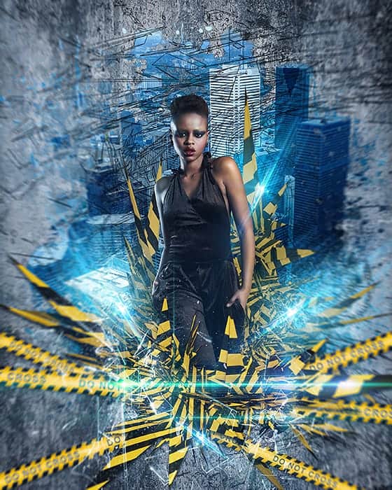
Final Results
That’s all! Look at the finished result. I hope that you get exactly the picture. Do not be afraid to experiment! It is always justified. Have a question or a comment? Leave it in comment – section below :)
Download the PSD
[vc_column width=”1/1″ el_position=”first last”] [vc_cta_button title=”Download” href=”https://downloads.photoshoptutorials.ws/Cross the Line.zip” color=”btn” size=”btn-large” icon=”none” target=”_self” position=”cta_align_right” call_text=”Cross the Line.zip | 326 MB” width=”1/1″ el_position=”first last”] [/vc_column]
Tutorial by Maria Semelevich

Thank you very much for taking the time to study this tutorial! I hope you benefited it! I wish all lucked in your future achievements! I thank the authors of resources for their excellent work and good quality! If you have questions or need help, please contact me. I look forward to your feedback and creative works! You can contact me by e-mail – [email protected] or Facebook Deviantart Behance. I am open to suggestions and cooperation. With best wishes!- Maria Semelevich
10 responses to “Create this Poster Design with Abstract Effects in Photoshop”
-

Thanks on your marvelous posting! I genuinely enjoyed reading it, you might be a great author.I will ensure that I bookmark your blog and will eventually come back someday. I want to encourage yourself to continue your great work, have a nice holiday weekend!
-
I’m new to photoshop and mentioned in step 10 I’m supposed to look for a brush spot thumbnail, but I don’t know what or where it is.
-
In Step 37 I cannot open Filter > Filter Gallery and I wonder why
-
Go to the Image > Mode menu and check if your image is in RGB mode and 8-bits/channel color.
-
-
Love this lesson, i learnt several new techniques. Made the same and one with different photo’s
-
you can download Kaos Brush Set 2.0 here: http://www.brushking.eu/563/kaos-brush-set-20.html
-
Very nice !!!!!!!
-
Brush Kao Set can’t open :(. Please! check link again.
-
Brush Kao Set can’t open :(. Plz, test link again
-
Great tut, thanks.
But Kaos Brush Set 2.0 – Outof4mmo… the page you were looking for doesn’t exist.
Leave a Reply