
You should now have something similar to this:

Step 2
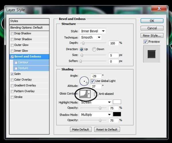
Now we are going to add some layer style effects to the type to give it a shiny glossy finish. Double click on the layer thumb to bring up the Layer Styles menu and Check the “Bevel and Emboss” option. On the Depth option keep it at 100% with a size of 5px. On the Shading use an Angle of -29 and an altitude of 37°, change the Gloss Contour to the option showed below:
Now Check the “Satin” option use the Blending mode to multiply with color black to 39% opacity. Change the angle to -71 , Distance to 11 and size 14. Change the contour to the shape on the example:

After applying the layer effects you should have something like this:

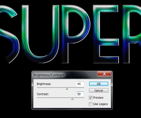
Now create a new layer and merge it into the type layer (Ctrl+E) to apply the effects in the same layer. At this point you can change the Brightness and Contrast of the type again if you feel the colors got too washed out:
Now we are going to enhance some of the highlights using the dodge tool (O). Take a very small ,soft brush and set exposure to 10% and the range to “Highlights”. Brush gently over the brightest highlights of the type following the contour of the letter:

Step 3
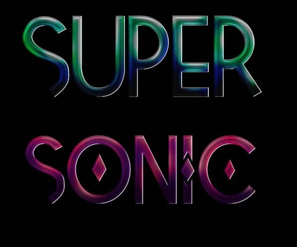
We are basically going to do the same process for the other 2 words. For the second one, I played around with the Tetra font and how the upper case and lower case of the font has different decorations for each letter.
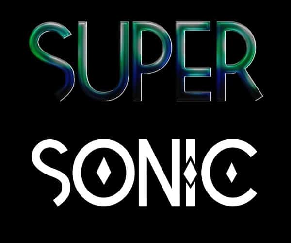
For this word, I chose a color palette ranging from a dark purple to very light pink.

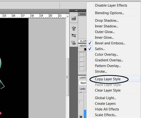
Feel free to experiment with your color choices and combinations. To apply the layer style effect you can copy the layer style from the previous word and paste it on the next word layer:
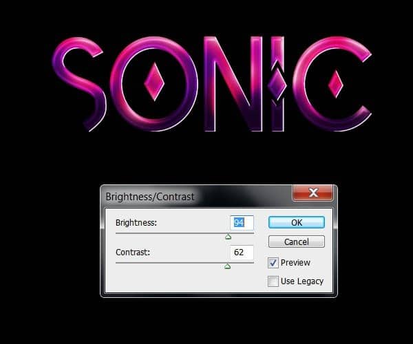
Don´t forget to fix the Brightness and contrast of the image as well as dodging the highlights of the type:

For the final word I´m going to use a combination of colors going from a very dark brown to red and light yellows.
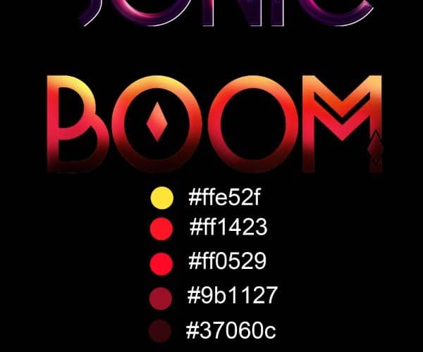
Copy and paste the layer style of the other words:

Remember to dodge the highlights and adjust the Brightness and contrast.

After you are done coloring type you should have something like the result below:
34 responses to “How to Create Shiny Retro Text with Photoshop”
-
NO PUEDO HACER NADA CON EL TEXTO NO DEJA CAMBIAR NADA NO CON LOS PSD QUE REGALA QUIERO PONER UN NOMBRE Y NO DEJA COMO LO AGO GRACIAS
-
DOPE
-
fantastic tutorial..like it very much..
-
I always believe typography is great art and thanks for this awesome experiment on it.
-
Please help! Im stuck doing the pen tool, it doesnt work as i want it to do. I can only se the paths but no color, how do i fix it? i have tried anything i can come up with.. Its sad being stuck when i have done so much already. Thx!
-
Thanks a lot.Plz describe more……………///
-
I’m on Photoshop CC 2014 and I cannot for the life of me get the same effect that Step 2 is telling me I should be getting. Any advice?
-
wow ….all Photoshop Tutorials are very nice …….
-
Most instructions were not given clearly, pen tool behaved in a very different way from what you barely explained, and the font you are using called “Tetra” is not in photoshop CS6 or CC.
-
Don’t know if it’s an actual problem or if i’m just doing something wrong, but I can’t figure out how to warp the light effects.
The program swears that there aren’t any pixels in the selection, and by the time i finally get the selection to warp, it doesn’t warp the glow of the light effect so there’s just an eclipse shadow left behind.Help?
-
Muy bueno Man!!..gracias por compartir y éxitos en tu oficio!
-
very nice work
-
really superb………
-
nice wonderful transliterate word
-
Final result looks really cool, lots of steps to do, but I wanna try this for sure! Thanks a lot for the tutorial! :D
-
are u a girl
-
-
Step 4 does not work for me? I have tried everything, does somebody know what the reason behind this could be?
-
Here’s a video to show how to do step 4
http://www.youtube.com/watch?v=T0LQKqykO2A
-
-
not good instructions for the lines on page 2, for on i can’t make them with this pen pressure crap, or even warp the lines correctly
-
panjang bener,,,tapi ok ,,thank ya gan,.
-
I ALWAYS HAVE A PROBLEM CONTROLLING MY PEN NEVER ENDS UP WHERE I WANT IT …SO I JUST DOWNLOADED SOME WAVE LINE BRUSHES TO SUBSTITUTE THAT PART OF THE TUTORIAL…THIS IS THE WEBSITE THERE ARE MANY WONDERFUL BRUSHES…..http://www.photoshopedia.com/photoshop/brushes/
-
@eva908 this website needs a user name and password to open!!!!!!!!
-
-
Very nice
-
for the life of me my pen line wouldnt do what you wanted it to do! argh!
-
Yes! Same problem!
-
Me too! Eh, sucks… Trying to figure out how to do it on my own..
-
Fantastic Photoshop and informative tools ..
Thanks to share…….
That is nice post and thanks to share……..
page 2 and 3 can’t open ?
very nice tutorials
Woooww… Its Cool :0
very good .. thanx
amazing,… super
-
good yaar


Leave a Reply