
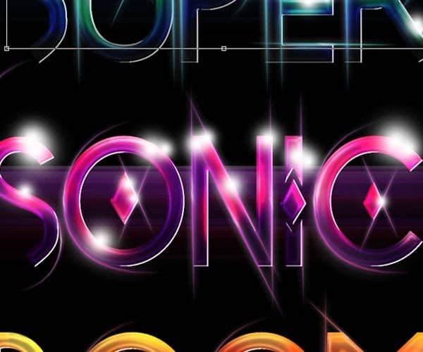
Lower the size of the brush and add some smaller glowing orbs around the bigger ones:

Repeat with the other two words:

Step 7
To enhance the glows now create some light crosses using the pen tool. Set the brush tool first to 100% hardness and a size of 4px with the pen pressure option selected and draw a cross using the pen tool and stroking the paths.
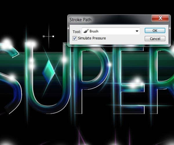
Rotate the crosses a little bit and duplicate the layer several times. Place the little crosses on top of every glow from the previous step.

Your image should look something like this after duplicating the crosses many times and placing them on the glow orbs:

Step 8
For the glowing waves details behind the type,first start off creating a new layer and setting your brush tool with 100% hardness and a size of about 9px. Whit the pen tool stroke a large horizontal line and then go to Filter>Distort>Wave. Use the next parameters for the first wave:

On new layers stroke some other horizontal lines and go to the wave filter again. I suggest you experiment with different settings here to get the waves you see more fit for your composition.

Select one wave layer and open the layer styles menu. Check the options “Outer Glow” and “Gradient Overlay”.
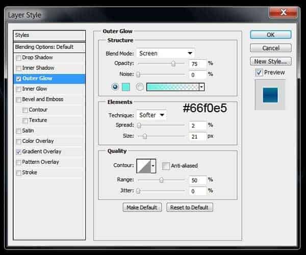
On the gradient overlay option select the “Reflected” style and change the colors of the gradient to match the color palette of your type.


You can now copy the layer style into a different wave layer you created and position them under your type.

Now you can duplicate and create new wave layers and tweak the color of the glow and the gradient overlay to match the colors of the other two words.
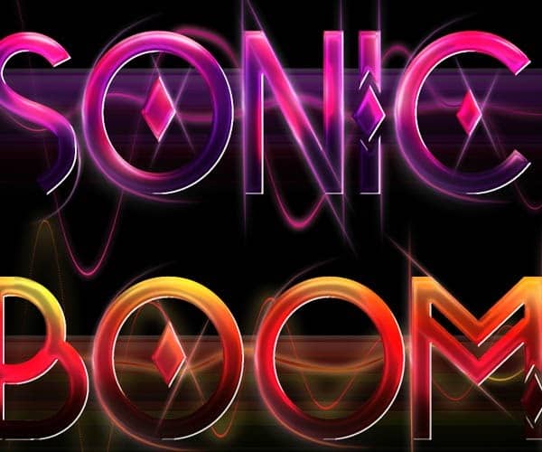
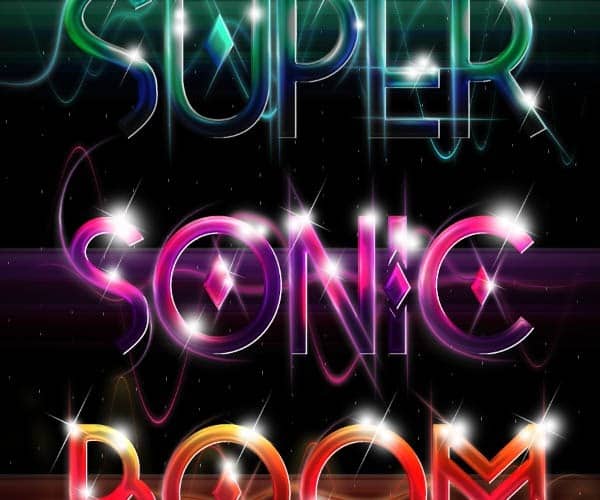
This is the result of the type so far:

Finally in this step, for the dotted background, we are going to use again the same method as with the waves but with different filter parameters to get the effect.

Transform the layer to fit the entire canvas:
Step 9
In this step we are going to add some bokeh stock images to finish up the composition and effects of the type. From the Sparklestock bokeh images select one you see fit for your illustration. Set the layer blending mode to “Screen” and lower the layer opacity to 30%:
34 responses to “How to Create Shiny Retro Text with Photoshop”
-
NO PUEDO HACER NADA CON EL TEXTO NO DEJA CAMBIAR NADA NO CON LOS PSD QUE REGALA QUIERO PONER UN NOMBRE Y NO DEJA COMO LO AGO GRACIAS
-
DOPE
-
fantastic tutorial..like it very much..
-
I always believe typography is great art and thanks for this awesome experiment on it.
-
Please help! Im stuck doing the pen tool, it doesnt work as i want it to do. I can only se the paths but no color, how do i fix it? i have tried anything i can come up with.. Its sad being stuck when i have done so much already. Thx!
-
Thanks a lot.Plz describe more……………///
-
I’m on Photoshop CC 2014 and I cannot for the life of me get the same effect that Step 2 is telling me I should be getting. Any advice?
-
wow ….all Photoshop Tutorials are very nice …….
-
Most instructions were not given clearly, pen tool behaved in a very different way from what you barely explained, and the font you are using called “Tetra” is not in photoshop CS6 or CC.
-
Don’t know if it’s an actual problem or if i’m just doing something wrong, but I can’t figure out how to warp the light effects.
The program swears that there aren’t any pixels in the selection, and by the time i finally get the selection to warp, it doesn’t warp the glow of the light effect so there’s just an eclipse shadow left behind.Help?
-
Muy bueno Man!!..gracias por compartir y éxitos en tu oficio!
-
very nice work
-
really superb………
-
nice wonderful transliterate word
-
Final result looks really cool, lots of steps to do, but I wanna try this for sure! Thanks a lot for the tutorial! :D
-
are u a girl
-
-
Step 4 does not work for me? I have tried everything, does somebody know what the reason behind this could be?
-
Here’s a video to show how to do step 4
http://www.youtube.com/watch?v=T0LQKqykO2A
-
-
not good instructions for the lines on page 2, for on i can’t make them with this pen pressure crap, or even warp the lines correctly
-
panjang bener,,,tapi ok ,,thank ya gan,.
-
I ALWAYS HAVE A PROBLEM CONTROLLING MY PEN NEVER ENDS UP WHERE I WANT IT …SO I JUST DOWNLOADED SOME WAVE LINE BRUSHES TO SUBSTITUTE THAT PART OF THE TUTORIAL…THIS IS THE WEBSITE THERE ARE MANY WONDERFUL BRUSHES…..http://www.photoshopedia.com/photoshop/brushes/
-
@eva908 this website needs a user name and password to open!!!!!!!!
-
-
Very nice
-
for the life of me my pen line wouldnt do what you wanted it to do! argh!
-
Yes! Same problem!
-
Me too! Eh, sucks… Trying to figure out how to do it on my own..
-
Fantastic Photoshop and informative tools ..
Thanks to share…….
That is nice post and thanks to share……..
page 2 and 3 can’t open ?
very nice tutorials
Woooww… Its Cool :0
very good .. thanx
amazing,… super
-
good yaar


Leave a Reply